Phase 1
Wireframing
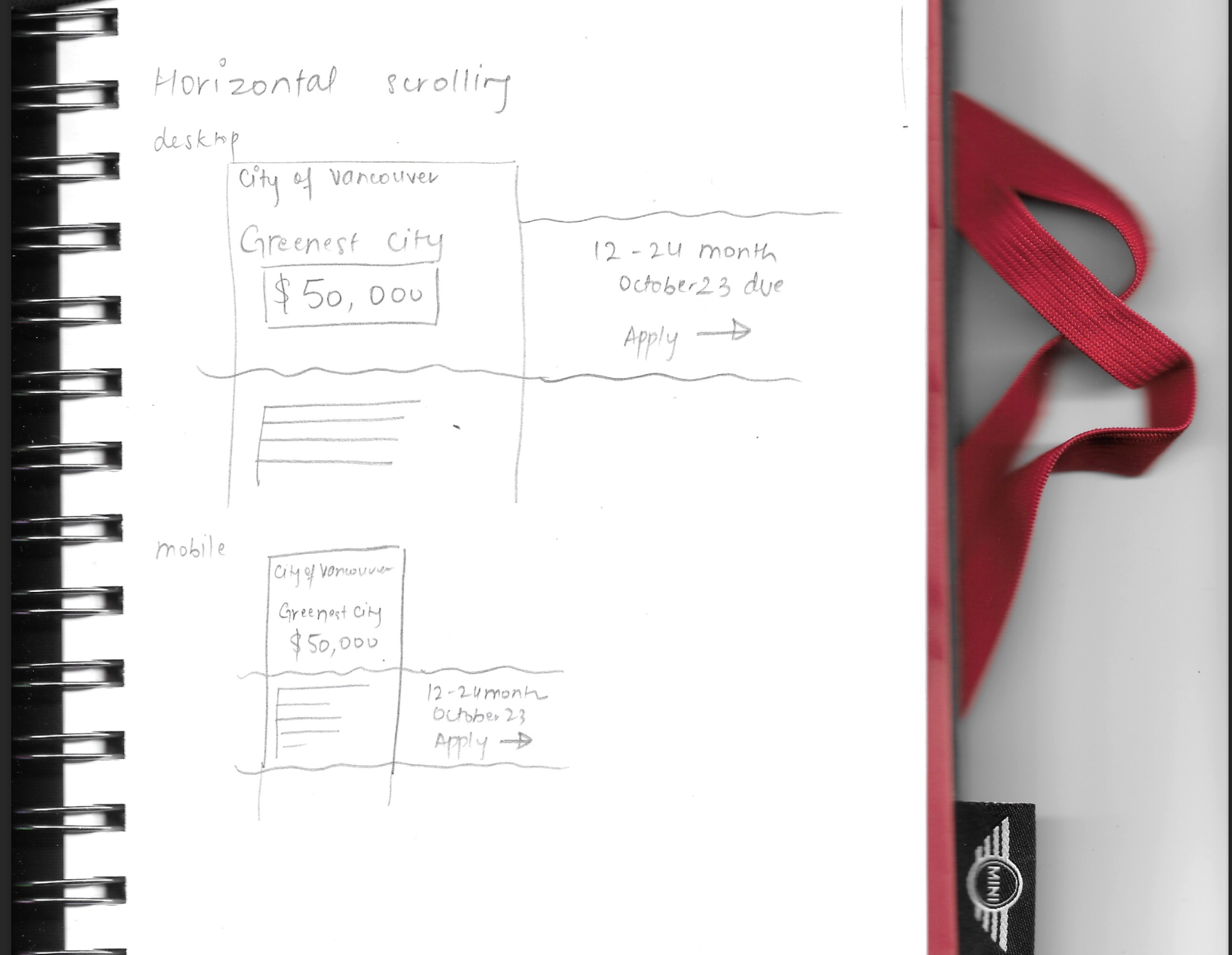
Each team member began by sketching wireframes independently to explore different layout ideas
for presenting the funding information. We then moved into Figma to create a digital version.
Our professor flagged that our Figma wireframe was too close to a finished prototype. It included
interactable elements, real images, and detailed styling instead of staying rough and structural.
A proper wireframe uses placeholder boxes, crosses for images, and focuses on layout only.
We understood the feedback, but due to timeline constraints we moved forward rather than revising.
It was an important lesson about the distinction between wireframing and prototyping.
Wireframes communicate structure. Prototypes communicate look and feel. Conflating the two
skips a valuable stage of iteration.
Phase 2
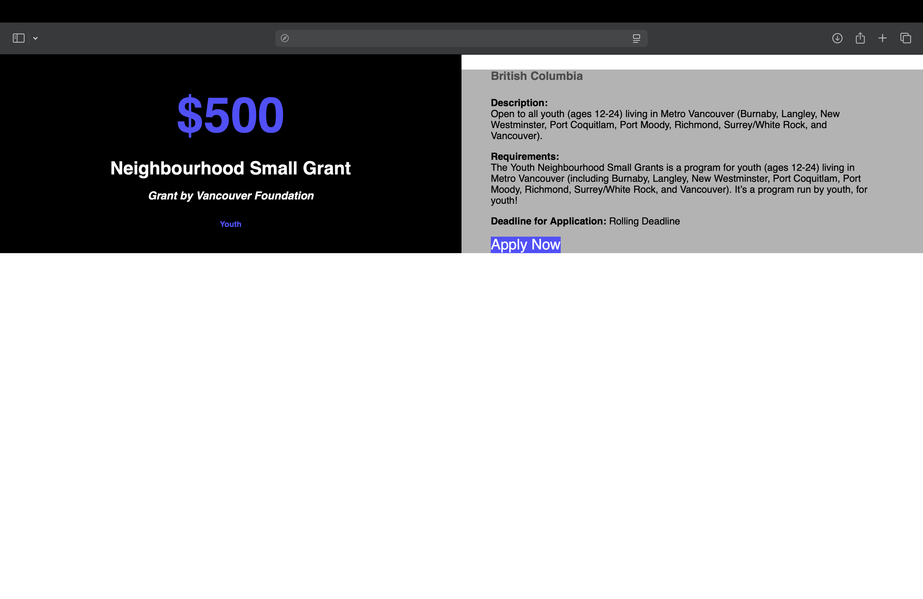
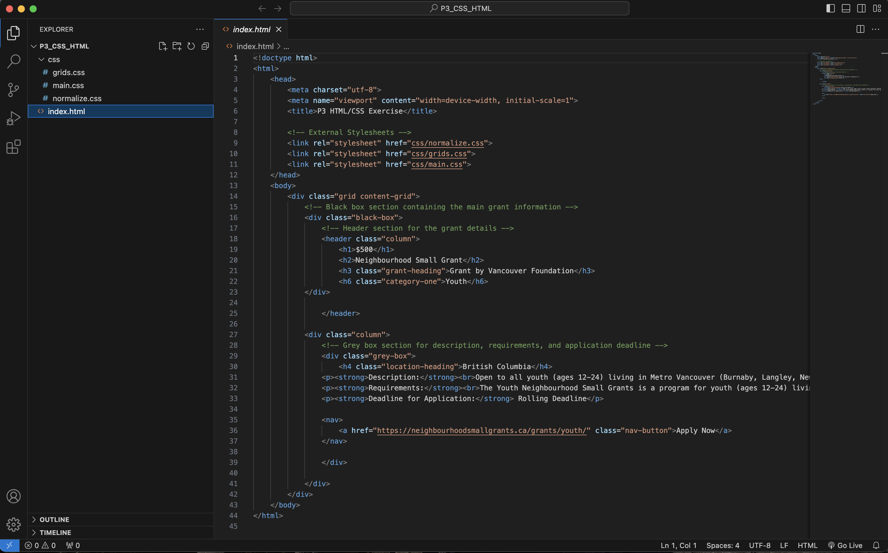
HTML Content & Client Feedback
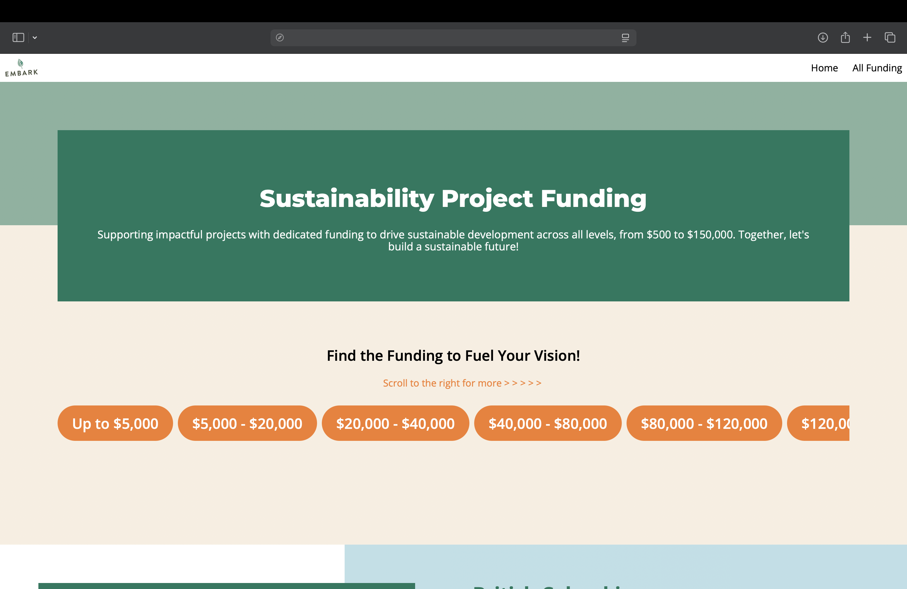
My teammate and I worked collaboratively on the HTML, building out the content structure and
populating the funding information from Embark's spreadsheet. We organized the grants into
sections by funding amount, each with consistent labels for description, requirements, deadlines,
and a learn more link.
Throughout this phase we received active feedback from Embark volunteers. Their input helped us
refine the content hierarchy, improve label clarity, and make sure the information felt
useful and easy to navigate for their actual users.
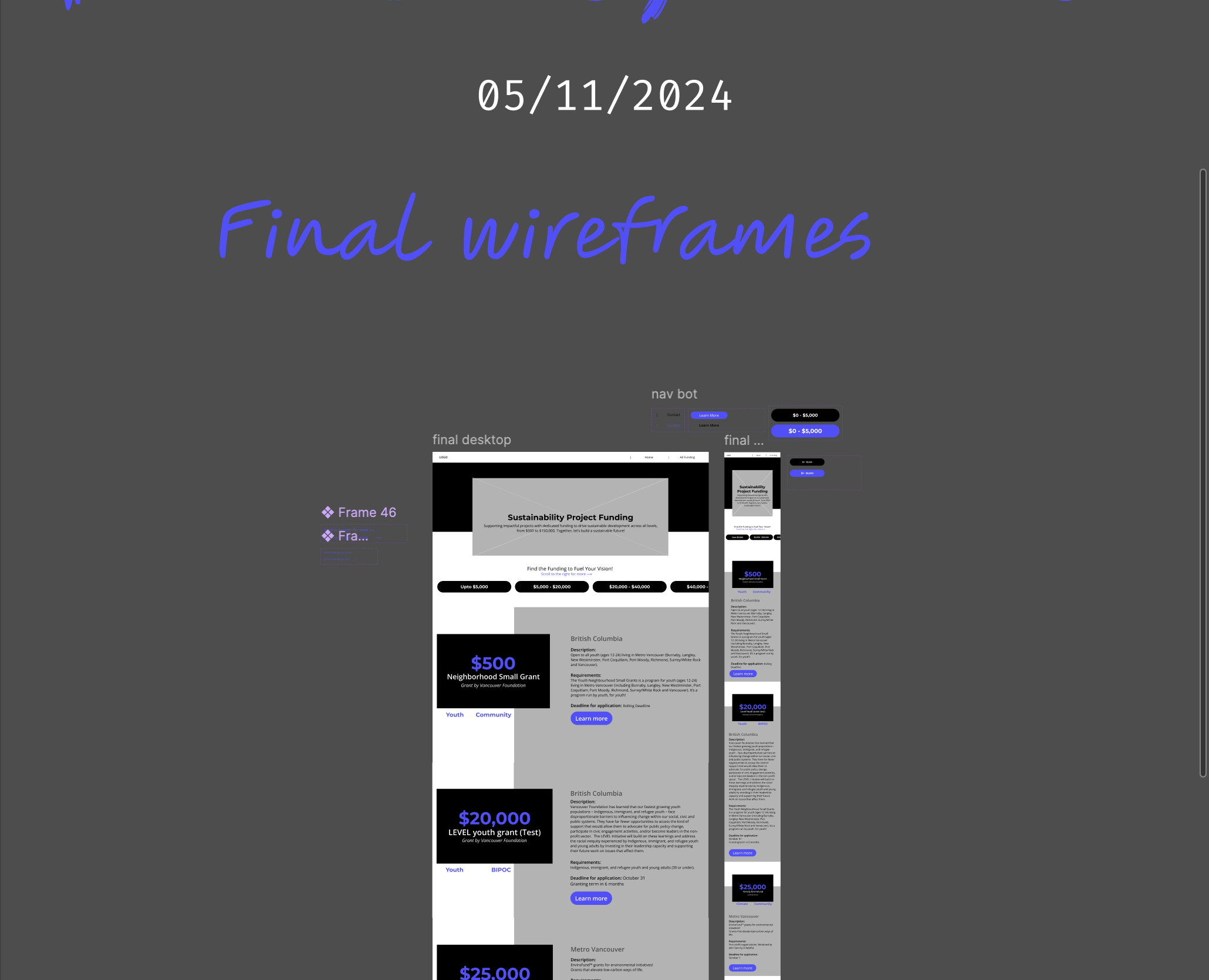
Phase 3
Figma Prototype & Visual Direction
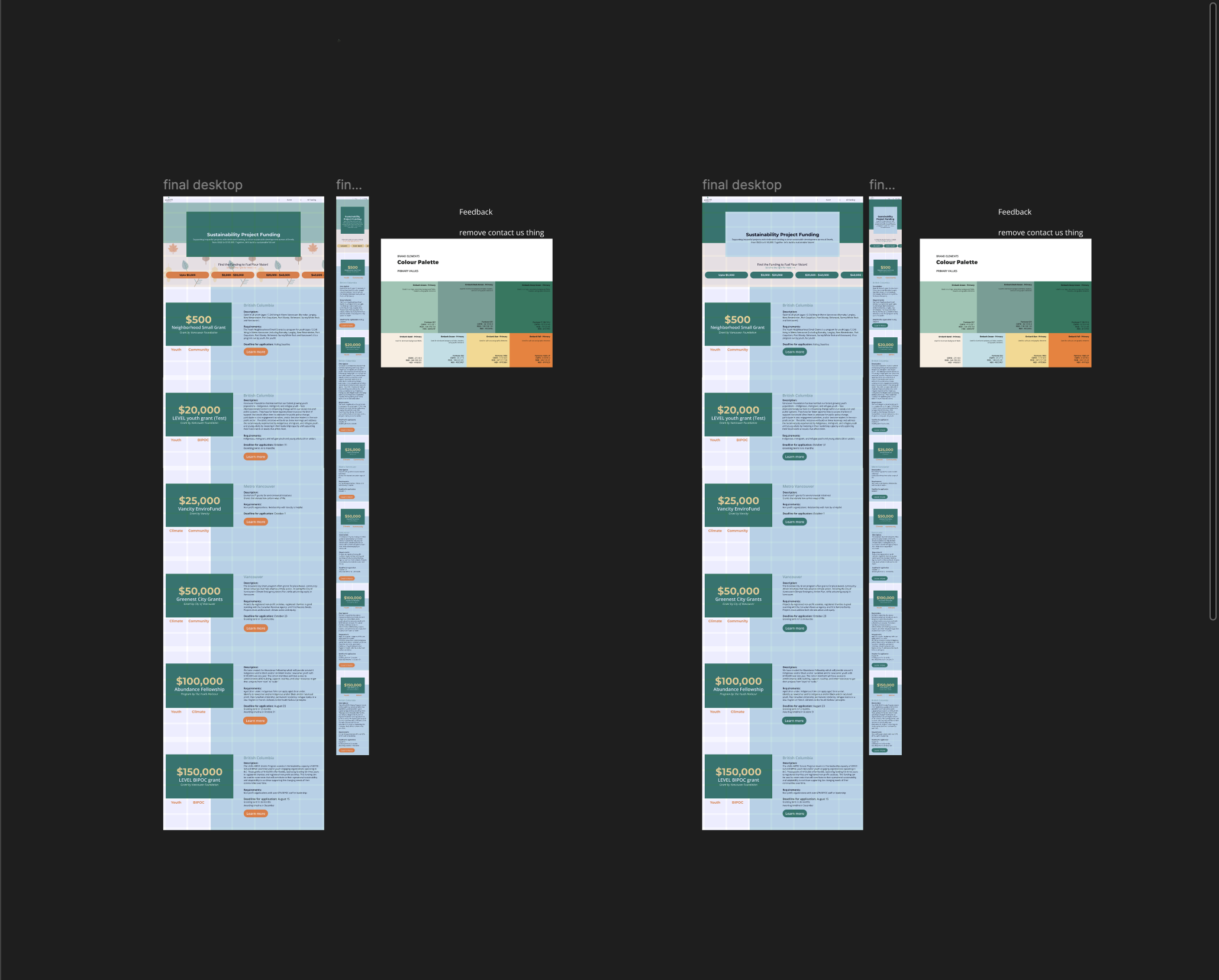
With the content structure settled, I built the Figma prototype applying Embark's provided
brand assets: their color palette, logo, and typography guidelines. This prototype served
as the visual reference for CSS development, giving the team a clear guide before writing
any styling code.