IAT 333 · Interaction Design Methods
The Glazing
Guide
4
Team Members
5
Phases
Real
Client
3 mo
Timeline
January – April 2025
Team: Manmeet Sagri, Amanda Eng, Victoria Lo, Christine An
My Role: Ideation, User Research, Content Writing & Co-Prototyping
Tools: Figma, FigJam, Google Docs
Client: Palette Art Studio, New Westminster
What is it?
A three-month interaction design project completed in partnership with Palette Art Studio.
Customers at the studio struggled with the multi-step glazing process: relying on verbal
instructions, spending long stretches comparing paint colours, and crowding around a single
Paint Bar station.
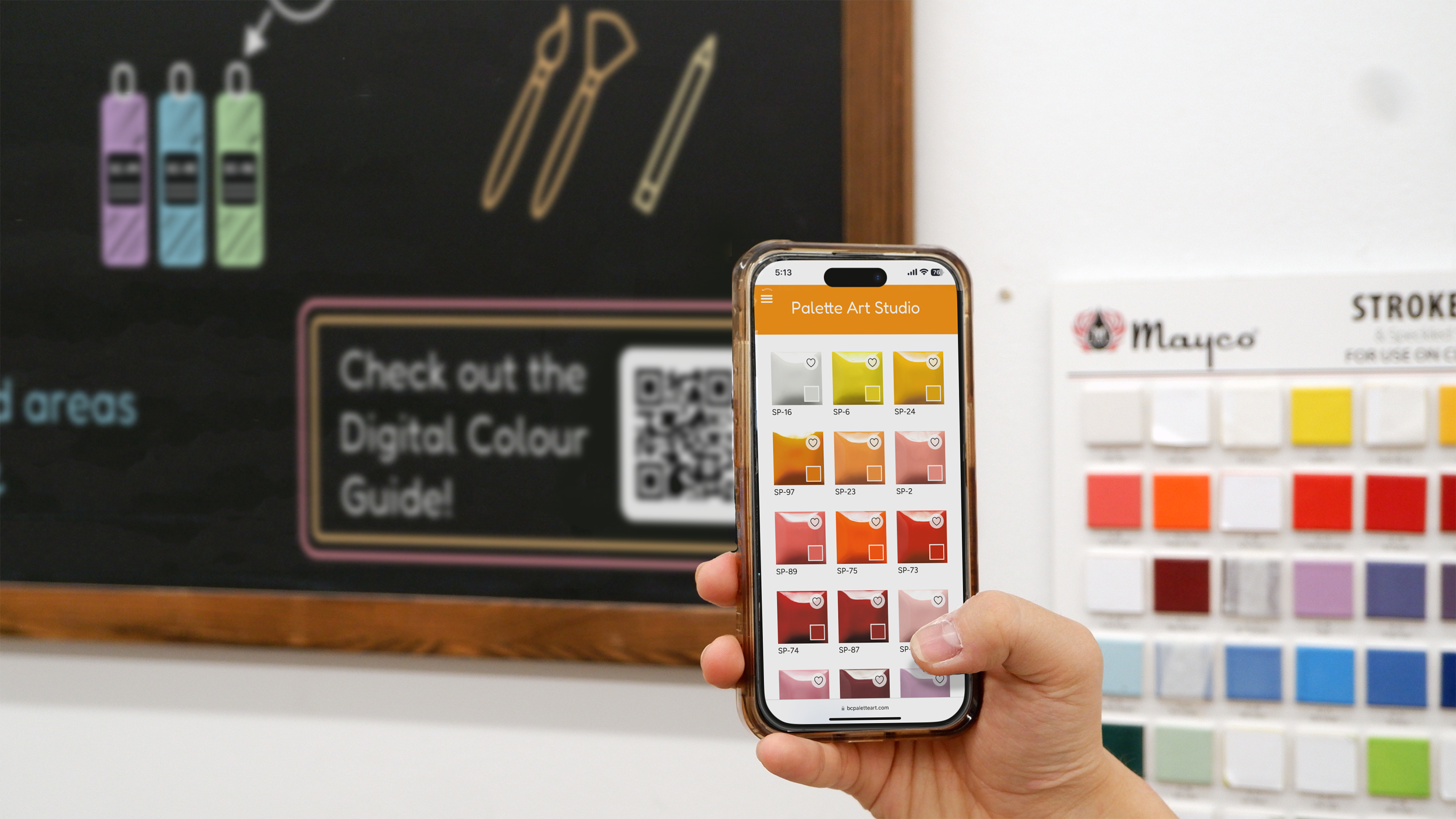
Our team designed a system of three connected interventions: a Digital Colour Guide, Table
Infographics, and a redesigned Paint Bar chalkboard. The goal was to give customers more
independence and reduce the workload on the studio owner, Narges.
This was the most demanding and most rewarding project I have worked on. We met every four days,
ran structured design retrospectives, and visited the studio multiple times for research and
feedback sessions.
The Process
Phase 1
Field Research & On-Site Observation
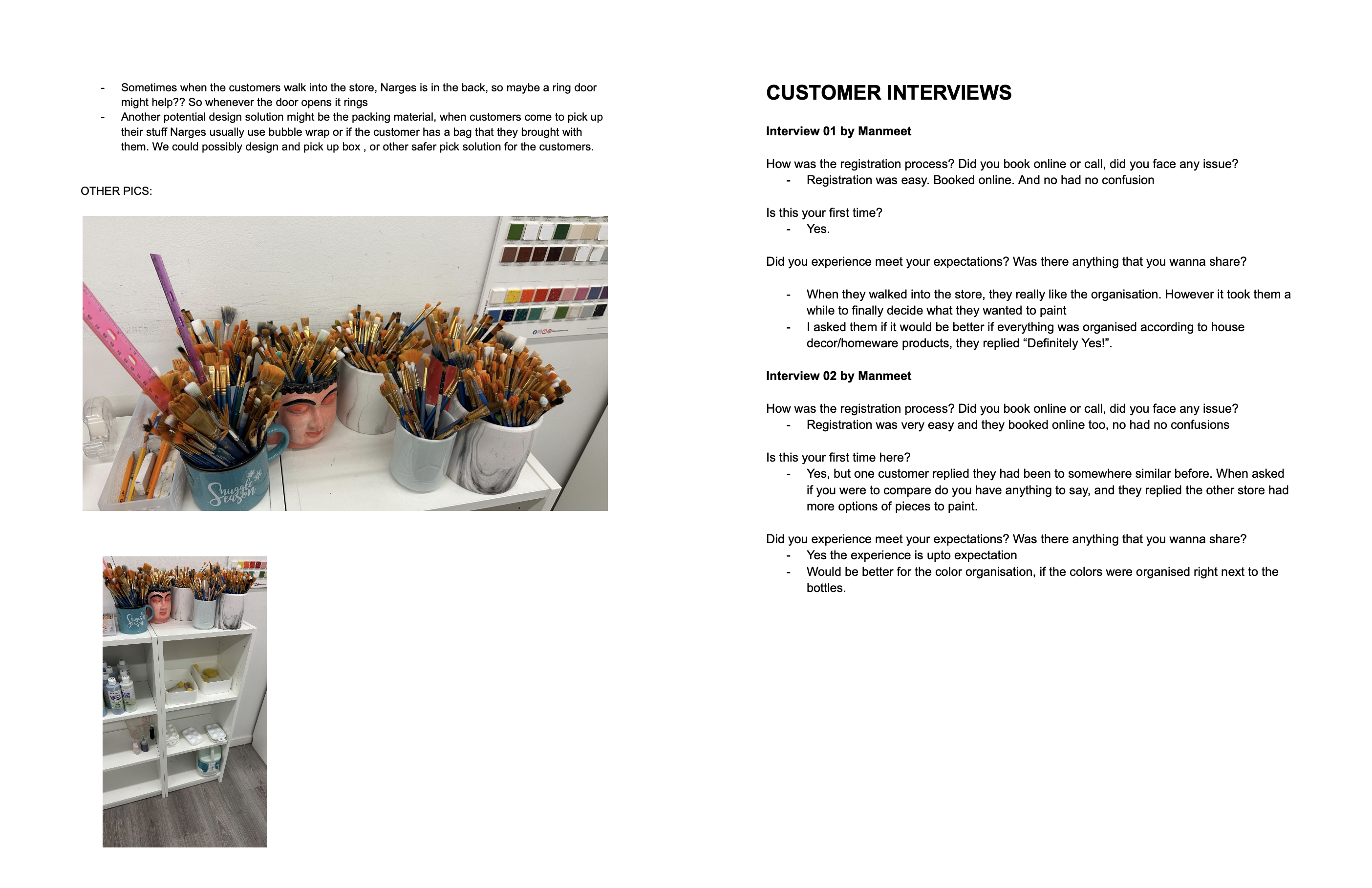
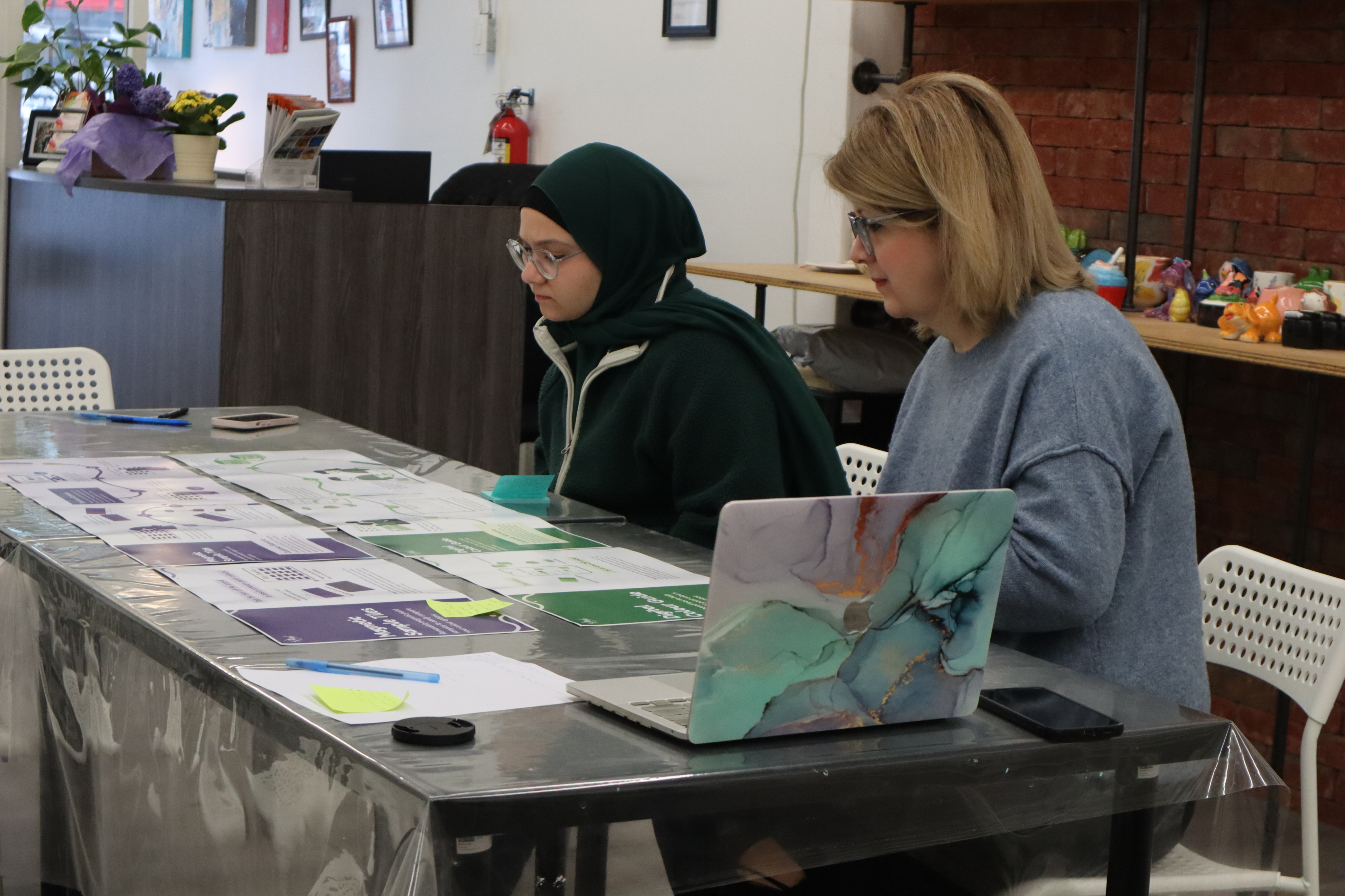
I co-led the user research phase. We visited Palette Art Studio twice. Once for a quieter
studio tour and owner interview, and once during a busy drop-in session to observe customers
actively painting. I interviewed Narges, the studio owner, to understand her workflow and
pain points. I also spoke with customers directly to understand how they navigated the
glazing process.
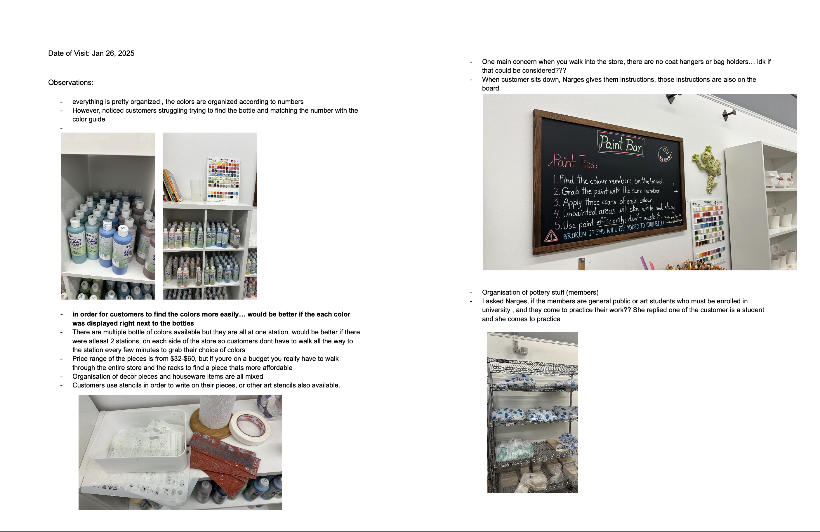
Key observations I documented: customers stood at the Paint Bar for several minutes comparing
colour swatches, many used their phones as colour references, Narges relied entirely on verbal
instructions because the only written guide was a small chalkboard, and taped-over tiles
indicated out-of-stock colours without any clear labelling system.
Phase 2
Synthesis, Personas & Journey Mapping
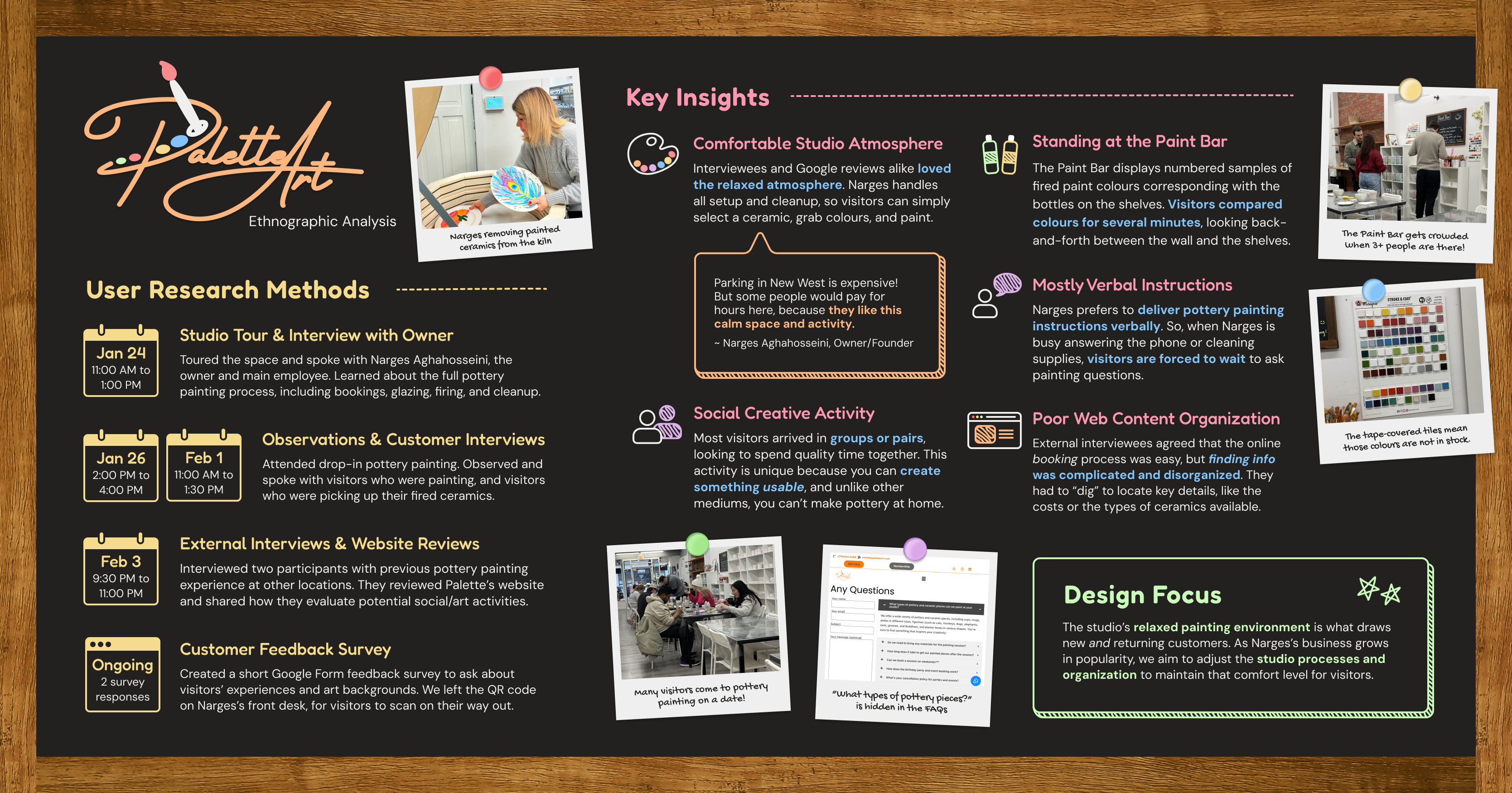
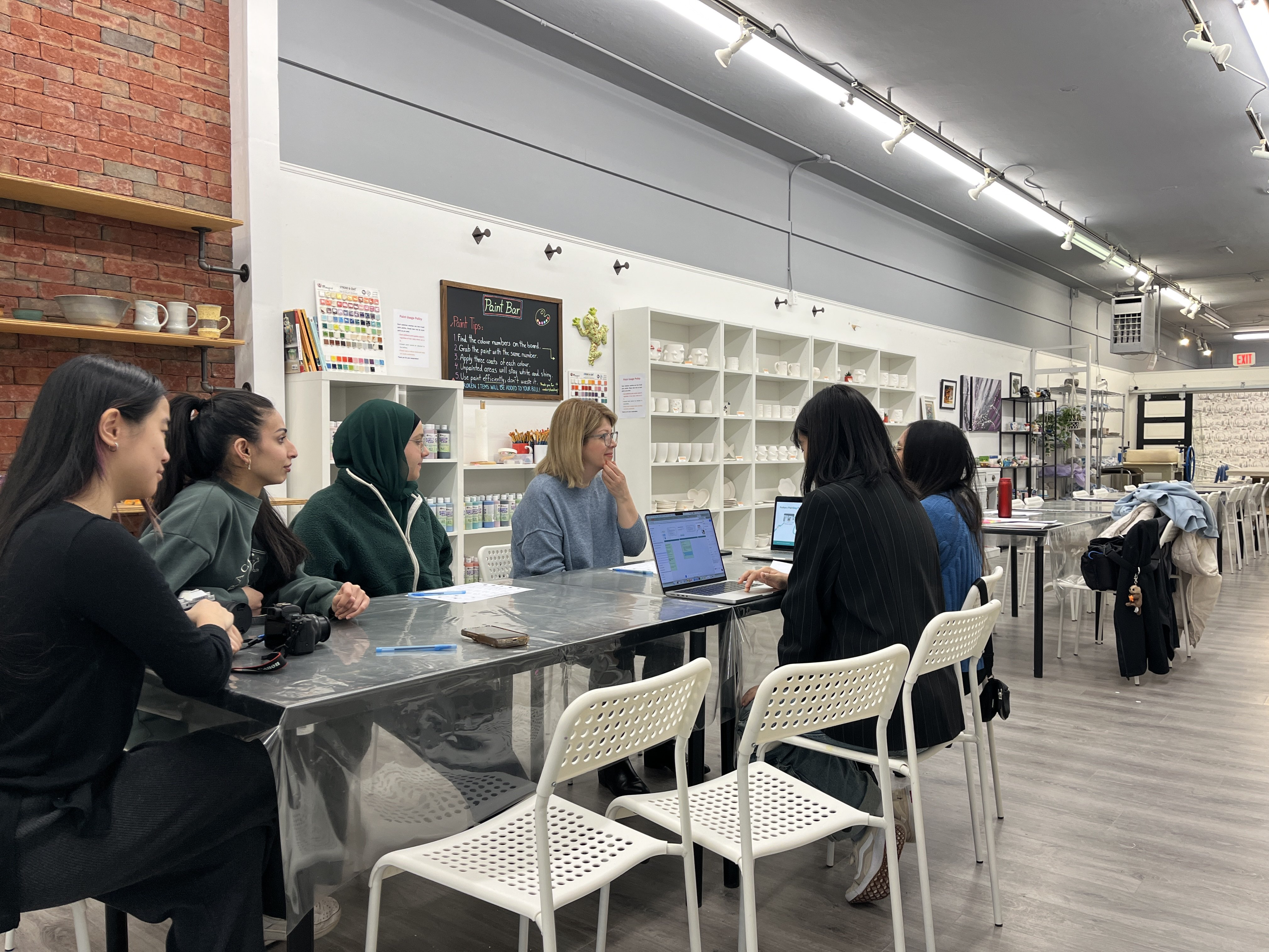
I contributed content and writing to the weekly research posters we produced throughout this phase.
Each week the team was expected to synthesize our findings into a clear deliverable. I wrote
the content for the participant group, observation notes, and key insights sections.
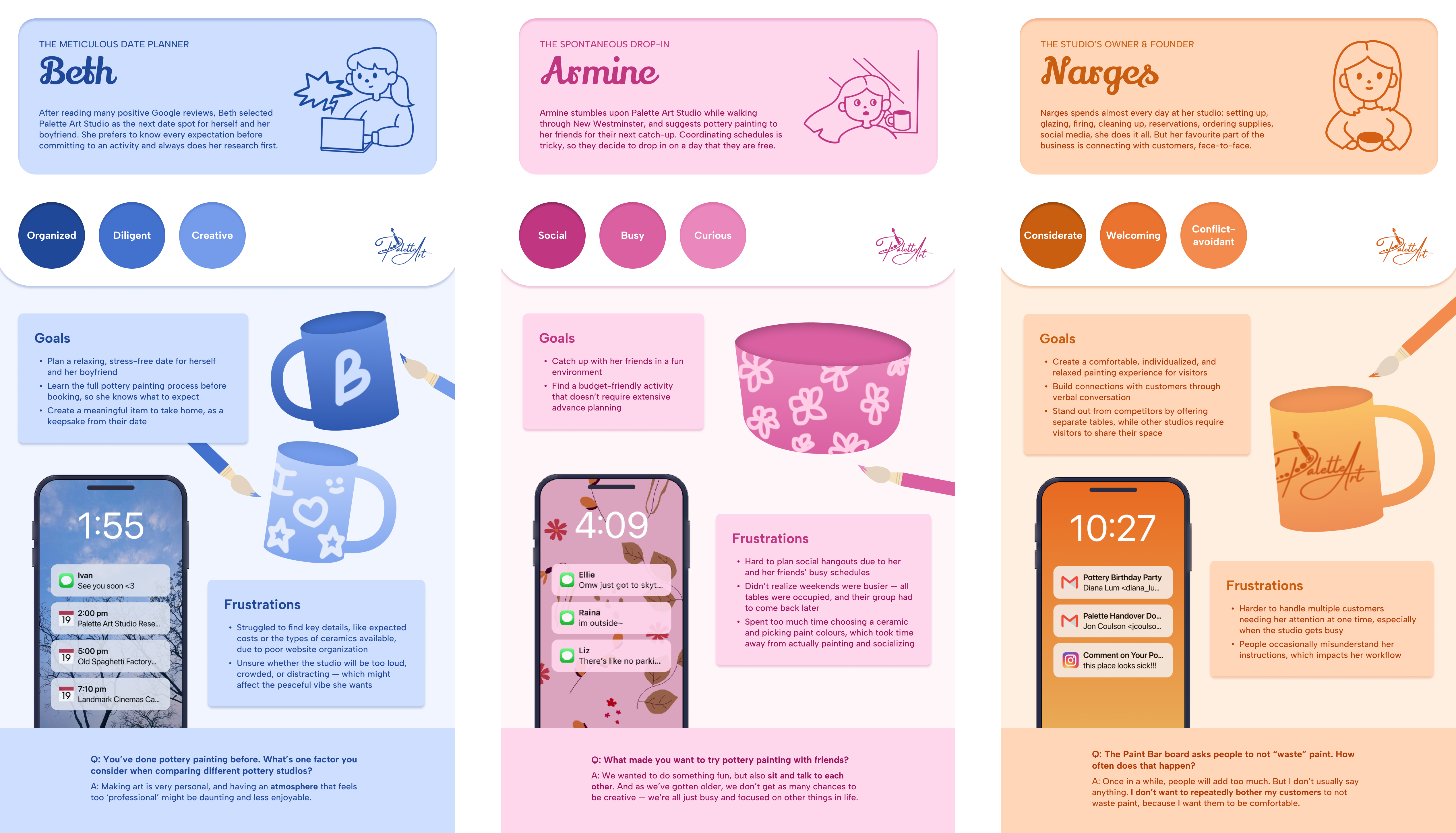
Together we built three personas: Beth (a planner who researches before booking), Armine
(a spontaneous drop-in), and Narges (the studio owner and sole employee). The journey map
traced Beth's full experience from discovery through departure, mapping her pain points and
moments of confusion onto each stage.
Phase 3
Ideation & Concept Development
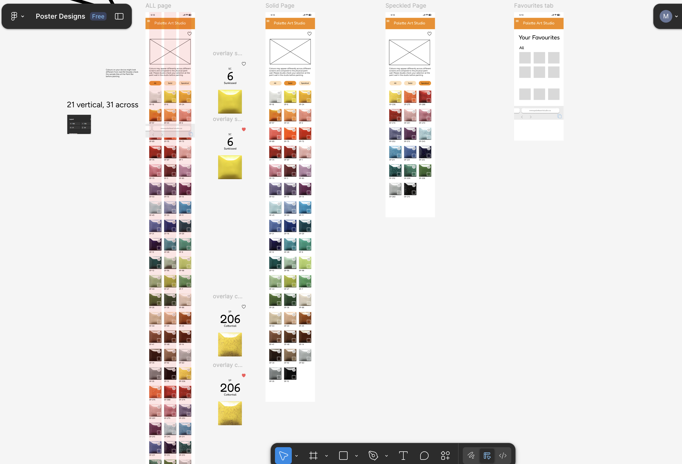
We generated three concept directions as a team. Two were ideas I proposed: the Digital
Colour Guide (a QR-accessible mobile tool for browsing paint colours) and the Magnetic
Sample Tiles (removable tiles for comparing colours at the table). The chalkboard redesign
came from another teammate.
We presented all three to Narges in a workshop session. The Magnetic Sample Tiles were
ultimately set aside because the production cost made them impractical for the studio.
That feedback directly shaped which concepts moved into prototyping.
Phase 4
Prototyping & Design
I co-prototyped the Digital Colour Guide interface in Figma with a teammate. My focus was on
the content structure and interaction flow: deciding what information appeared at each step,
how colours would be numbered and displayed, and how the mobile layout would guide a customer
from the QR code scan through to selecting their paint at the bar.
Throughout this phase our team ran weekly design retros led by our team lead. These sessions
helped us step back, identify what was working, and prioritize what needed to change before
the next iteration. Working this way taught me how much clearer design decisions become when
you build in structured reflection time.
Phase 5
Final System & Outcomes
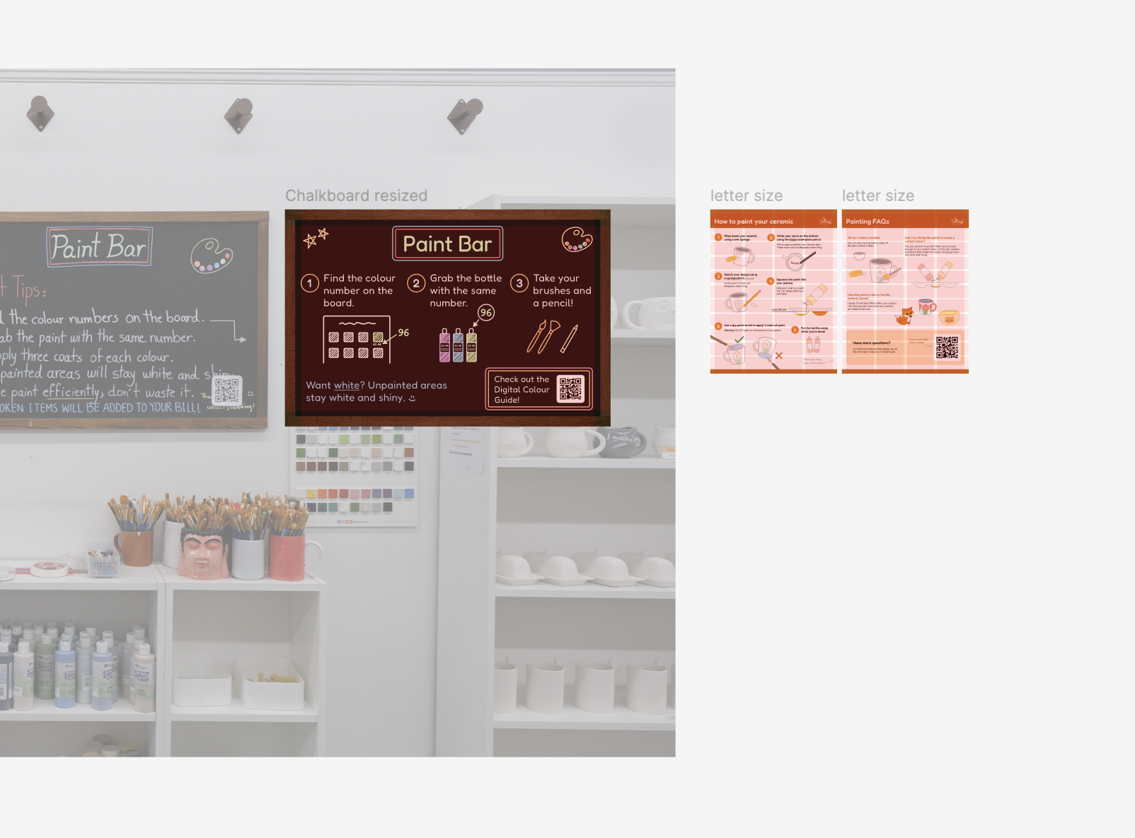
The final Glazing Guide is a three-part system. The Digital Colour Guide lets customers browse
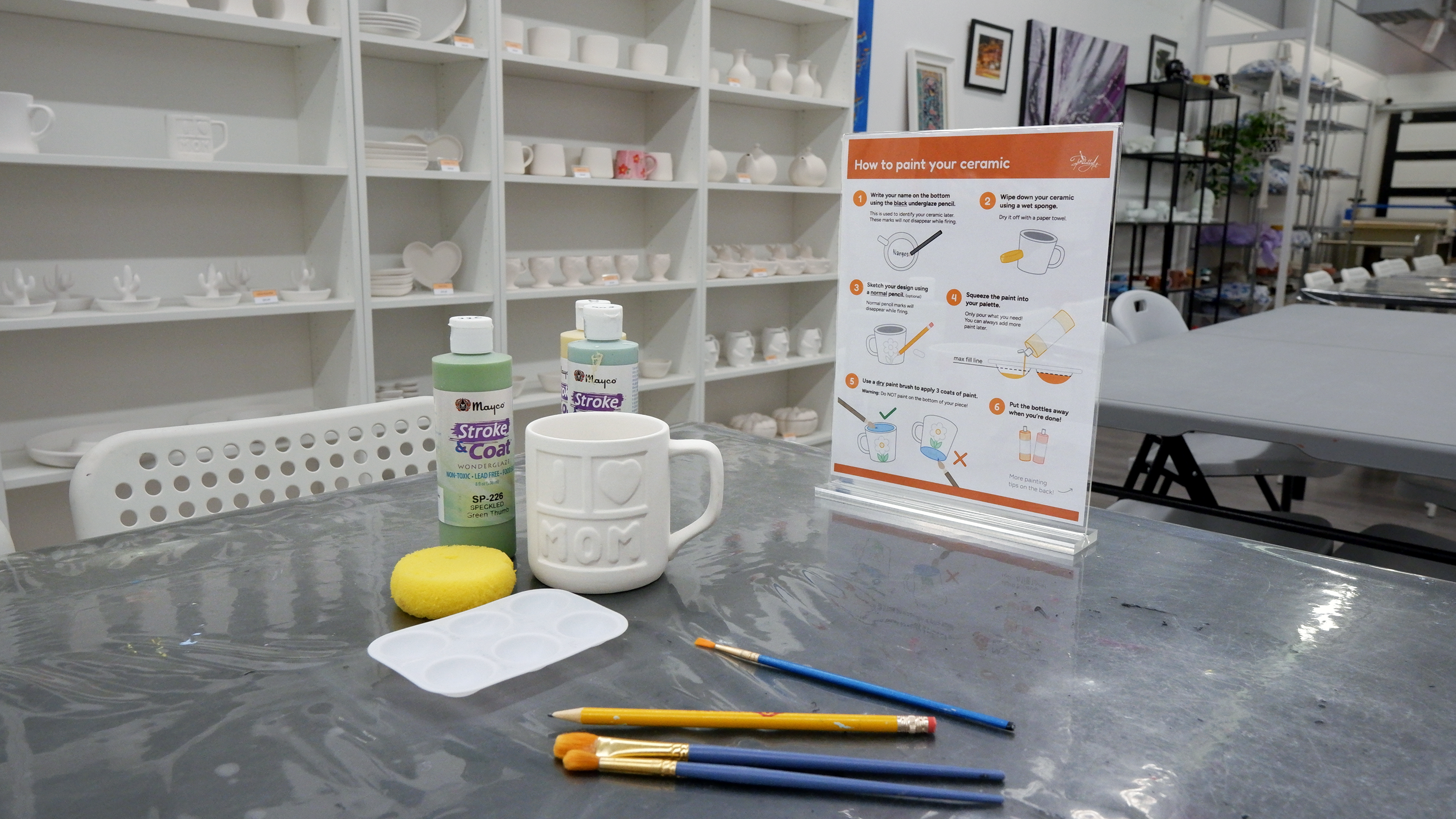
and compare paint colours from their phone using a QR code at the Paint Bar. The Table
Infographics give step-by-step painted pottery instructions and FAQs directly at each table.
The Redesigned Chalkboard replaces Narges's verbal instructions with a clear visual guide
at the Paint Bar itself.
Together these three interventions reduce crowding at the Paint Bar, give customers more
confidence to work independently, and free up Narges to focus on the parts of her work
she actually enjoys.
Problems & Reflection
Problem
Customers had no independent way to explore paint colours.
The only colour reference was a wall of numbered tiles at the Paint Bar, which required
customers to stand in one spot and compare colours visually without being able to bring
samples back to their table. The Digital Colour Guide solved this by giving customers a
mobile tool they could use from their seat, reducing crowding and speeding up the decision.
Problem
Verbal instructions created bottlenecks around Narges.
Because Narges delivered all glazing instructions verbally, customers who missed a step or
forgot what to do had to wait for her to be free. The table infographics and redesigned
chalkboard gave customers a written reference they could check independently, reducing how
often they needed to interrupt Narges during busy sessions.
Challenge
I had less confidence in visual execution than in ideas and research.
Coming into this project I was stronger in ideation and writing than in visual design and
illustration. My teammates were more confident illustrating and building in Figma, which
pushed me to contribute where I was strong: generating concepts, writing poster content,
and leading research conversations. I also picked up new Figma skills from working closely
alongside my team throughout the prototyping phase.
What I Learned
Structure, leadership, and iteration make the difference in team design.
This project changed how I think about design work. The structured meeting schedule, weekly
deliverables, and regular design retros meant we never lost momentum and always knew what
needed to happen next. Working under strong team leadership taught me that good collaboration
is not just about everyone contributing equally. It is about everyone contributing where
they are strongest, and being honest about where they need support.